


Case Study
In this case study, our mission was to create a user-centric, mobile-first design that not only provided users with the vital information they needed to purchase a new mattress, but also added substantial value to their decision-making process. Through extensive competitor research and user-centric analysis, we aimed to boost conversion rates and ensure that Casper's customers could confidently choose the perfect mattress for their needs. Join me as we delve into the details of this transformative UX design journey, where usability, data-driven insights, and a commitment to meeting user expectations, and business needs were at the heart of the project.
Problem Statement
Navigating the online shopping experience for a significant purchase can be a daunting task, particularly when considering a product as personal and essential as a mattress. Shoppers often prefer the tactile experience of physically trying out a mattress before committing to a purchase like this. Alternatively, they seek comprehensive information to ensure the mattress aligns perfectly with their unique needs and preferences. The current process, which involves toggling between multiple website windows, falls short of providing a user-friendly solution to this challenge.
Objectives & Goals
Research and understand what information is most important to our consumers when looking to purchase a new mattress, and how the obstacles of shopping online play into that information.
Create an intuitive and user-centric product comparison page that presents essential information in a manner aligned with Casper’s brand and design system.

My Process

Research
In order to gain comprehensive insights into the pain-points users encounter while shopping for mattresses on Casper’s website, I conducted multiple rounds of user testing, allowing the users free range to explore the current website, seek pages for information, and to find their favorite mattress and proceed through checkout. These tests involved similar tasks, but were performed on various devices to understand limitations of the users. This approach was essential because 80% of Casper’s customers proceed with making a purchase via mobile devices. However, to truly grasp the root of the issue, it was crucial to pinpoint where the customer exploration begins.
User Testing:
100%
Participants opened multiple windows of mattress PDP’s to compare information between each model, on every device tested.
30%
Users mentioned that the information on the PDP’s included technological words that they were not familiar with, and had to seek more information to fully understand.
80%
Mentioned that they would likely do the comparison of the mattress models on a computer so the separate windows can be side by side.
60%
Mentioned that they would likely do the comparison of the mattress models on a computer so the separate windows can be side by side.
90%
Suggested a single page that users can sort through different mattress combinations and see the important information more easily without having to open multiple browser windows.
User Needs:
Users seek comprehensive information, including mattress specifications, features, and differentiation between available mattress models.
Prioritizing ease of use, users expect an intuitive interface with straightforward navigation, and a clear visual hierarchy that guides them through the mattress options effortlessly, regardless of the device they are using.
Ensuring the ease of finding the comparison page at various points in the user journey is crucial to Casper’s customers.
Competitor Analysis:

Purple Mattresses is a direct competitor of Casper’s in the e-commerce and brick and mortar landscape. Below are some of the positive and negative features of their compare tool:
Positives:
Easy to understand information allowing users to be able to easily determine the differences between each of their mattress models.
The comparison page defaults mattress selection by collection, allowing users to easily compare and differentiate between the mattresses by step-up story, seeing added features, technologies, and price.
Negatives:
Comparison page is not easy to locate. The CTA’s are only located on the PLP page for each mattress collection, and not located in any of the menu’s, or individual mattress PDP’s.
White the user is reviewing content and information on the comparison page, upon scroll there is no clear indication for what information belongs to each mattress. There is also no direct path for the user to move forward to individual PDP pages if they were interested in purchasing one of the products being compared.

Nectar Mattresses is a direct competitor of Casper’s in the e-commerce landscape, with 3rd party brick and mortar distribution. Below are some of the positive and negative features of their compare tool:
Positives:
Information provided for the user on the comparison page is easy to scan, and gain a basic understanding between the differences of each of their mattress models.
Once the user scrolls past the initial viewport, a banner sticks to the top of the page indicating the mattress name, image, price, and reviews for the information following below each mattress model.
Negatives:
Information provided for the user regarding specific features and technologies are vague, and do not provide enough contextual understanding without leaving the comparison page.
The use of heavy iconography and graphs are a great feature, however Nectar does not supply any understanding or meaning of the icons or graphs for the users to understand the information being provided.


Product Users
The target user base at Casper is all genders between the ages of 18-45 years of age. These users are adolescence that have just graduated from school and about to start college, young adults who are purchasing a bed as their primary use, and families who are purchasing a bed for a room in their home both for family and guests.


User Flows
Scenario 1:
A user enters Casper’s website on the home page, and is looking for a way to compare different mattress models that the company has to offer.

Scenario 2:
User arrives on the compare page, and wants to proceed with purchasing one of the mattress that are being compared.

Functionalities

Main Screens
Based on user insights derived from thorough research, a primary focus was placed on catering to the critical user needs of seamless access to the mattress comparison feature across various sections of the website, with a focus on mobile first design. The process commenced with the development of key screens, with particular attention to two pivotal aspects. Firstly, in the realm of global navigation, a strategic decision was made to incorporate a “Compare” CTA as a secondary action to the mattresses PLP CTA within the fly-out menu, ensuring accessibility throughout the entire website.
Secondly, when crafting the compare page itself, our focus was to create a user-friendly, mobile-first experience that simplified the browsing and decision-making process. Furthermore, we recognized that clear and engaging visuals were essential for enhancing comprehension and storytelling, especially when it came to conveying intricate mattress technologies.


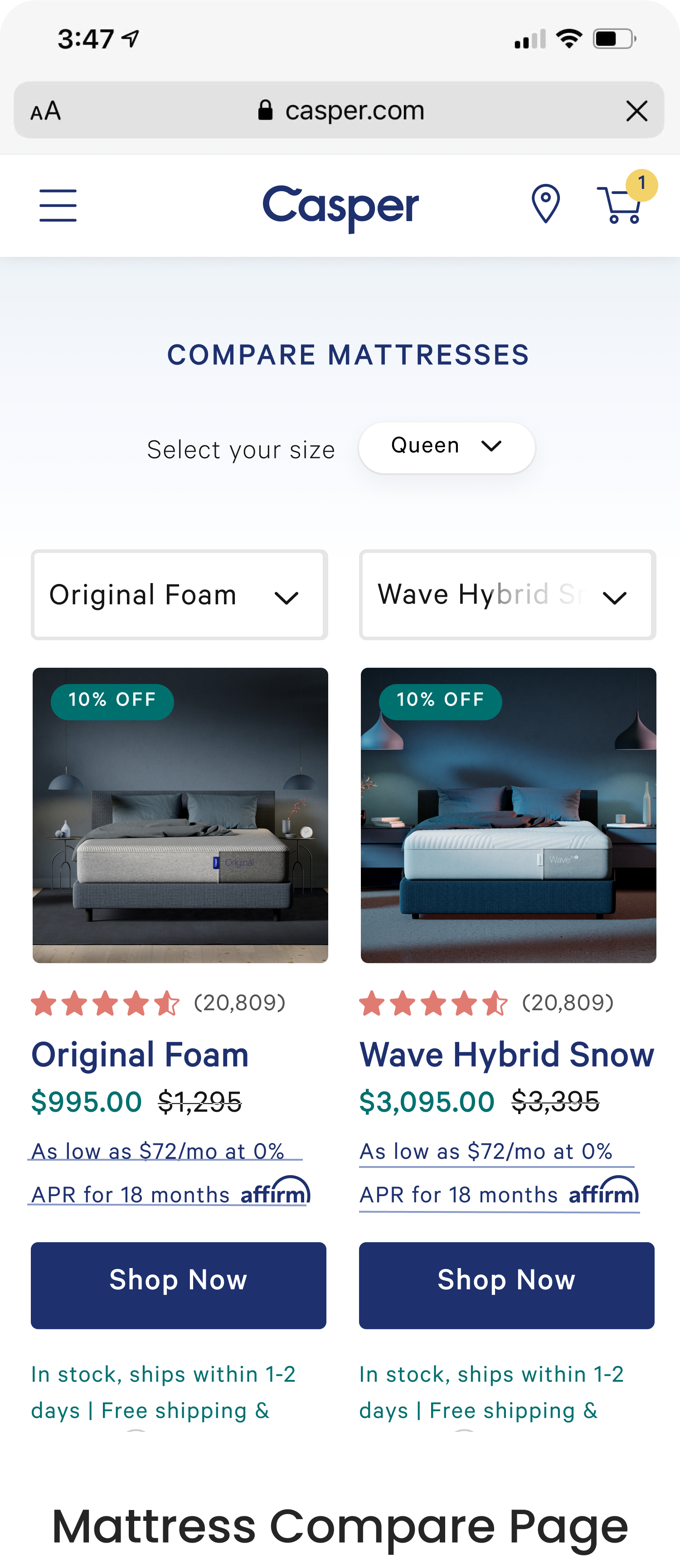
Final Design
Following numerous rounds of usability testing and fine-tuning, the team arrived at a final design for our mattress comparison page, which places a premium on user-experience. Our primary objective was to react a straightforward and intuitive product for users to compare mattresses across Casper’s line-up with ease.
We’ve ensured that the information is presented in a clear and accessible manner, bolstered with engaging visuals that effectively convey the technological features each mattress has to offer. Moreover, we’ve seamlessly integrated navigation options that allow users to transition effortlessly from the comparison page to individual mattress PDP’s, simplifying the path to purchase. This refined design aligns perfectly with our commitment to delivering a premium user experience tailored to those exploring the Casper mattress lineup.


Reflection
One of the primary objectives of this project was to enhance the awareness of Casper’s mattress lineup among consumers, making it easier for them to distinguish the unique features and benefits of each mattress. We are thrilled to see that the compare page has played a pivotal role in achieving this goal. Users now have a centralized hub to explore and understand the various options, fostering a deeper connection with he brand and their products.
Post-launch, we’ve closely monitored the page’s performance, and the results have been promising. We’ve observed a significant increase in the mattress conversion rate of 34%, indicating that the compare page has not only heightened consumer awareness, but has also been instrumental in driving more users towards making informed purchasing decisions. This is a testament to the effectiveness of user-centered design in addressing the needs of Casper’s audience, enhancing their experience, and ultimately contributing to the business goals and metrics of success.
