


Case Study
In this case study, I invite you to embark on a journey through the world of specialty coffee like never before. Jitters is more than just an app; it’s your gateway to discovering the hidden gems of your local coffee scene. The user-centric design focuses on making it effortless for you to find and savor the finest craft coffee shops near you, while fostering a stronger connection between coffee enthusiasts and local businesses.
Problem Statement
Finding craft coffee shops in your area, or while traveling has never been easy. Searching through endless blogs on google, social media apps, and even your devices native maps - never finding the results you are looking for, and ending in a doom scroll. There has to be an easier solution.
Objectives & Goals
Understand users current pain-points of discover, and research and ideate a solution which addresses these issues.
Design a seamless experience for users to be able to search and locate local craft coffee shops in their area, or an area which they are planning to visit.
My Process
Research
To get a better understanding of how craft coffee consumers currently search and find local coffee shops, I sought out 8 avid consumers to conduct interviews - with the understanding of learning their current methods, and empathizing with their pain-points in the process. These participants come from all different backgrounds of career, lifestyle, and geographical area’s within the United States - ranging from 20 - 34 years of age.
User Testing:
80%
Use google to search for locations closest to them, or an area in which they are traveling to.
60%
Participants read reviews about the location prior to making a decision.
50%
Knowledge of the food and beverage offerings is a factor into the decision based on dietary restrictions.
90%
Current proximity to their location is the most important factor into their decision.
30%
Information about the coffee is important such as origin, fair trade practices, roasting location and preferences, and more
User Needs:
An easy way to streamline finding new and local craft coffee shops in the users area, without having to search through social media apps, or google search results.
A way for users to view locations information such as contact information, hours, information about the location, food and beverage menu, photos, reviews, and more.
The ability to save locations easily, so the user is able to revisit at a later date.
Competitor Analysis
Cuppings App

Cuppings is an app on the iOS store which allows users to find coffee shops based in their area. However, there are some limitations of the app which do not result in the best user experience.
Positives:
Uses location preferences to deliver a list of location results to the user that are closest to them.
Allows the user to view the locations in both formats of a list, and on a map.
Negatives:
Does not deliver the user any information regarding the coffee shop besides the name and address. Some important information missing is: Hours, Location Bio, Menu, Photos, Reviews, Contact information, etc.
The app is mainly focused in the overseas market, with very limited focus on the United States market - with the exception of a small amount of major cities.
Starbucks App

The Starbucks mobile app allows users to search for Starbucks cafe locations based on their location, and offers many features that allow an amazing user experience.
Positives:
Offers user many benefits such as mobile ordering, payment wallet, and purchasing incentives, as well as a functioning e-commerce platform.
Provides users the ability to save individual cafe locations, and use the saved locations to revisit again allowing for a seamless user experience when placing mobile orders.
Negatives:
Limited use to only Starbucks cafe locations.
Does not offer information on individual cafes outside of the location, and menu offerings.


Product Users
The target user for this product are all genders, with a focus on age between 18-40 years old. These users generally work traditional jobs, as well as freelance jobs which allows users to travel for both leisure and work trips. Their pain-points are time spent searching for their morning coffee, and location distance from where they are currently located.


User Flows:
Scenario 1:
A user downloads the Jitters app and is brought to the splash screen. The user wants to gain enterance into their account to search for a shop location near them.
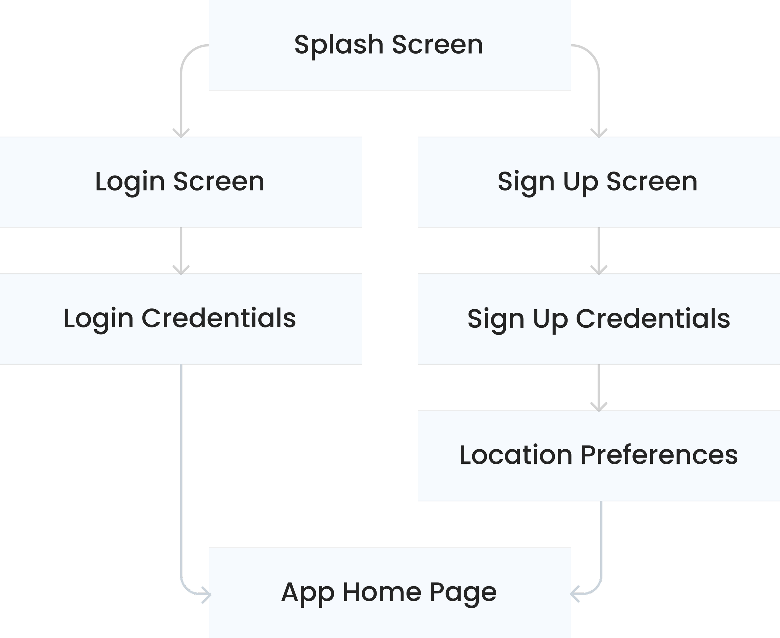
Scenario 2:
A user has now gained access to their account and lands on the home page. The user would like to find a shop location closest to them to get their morning coffee.
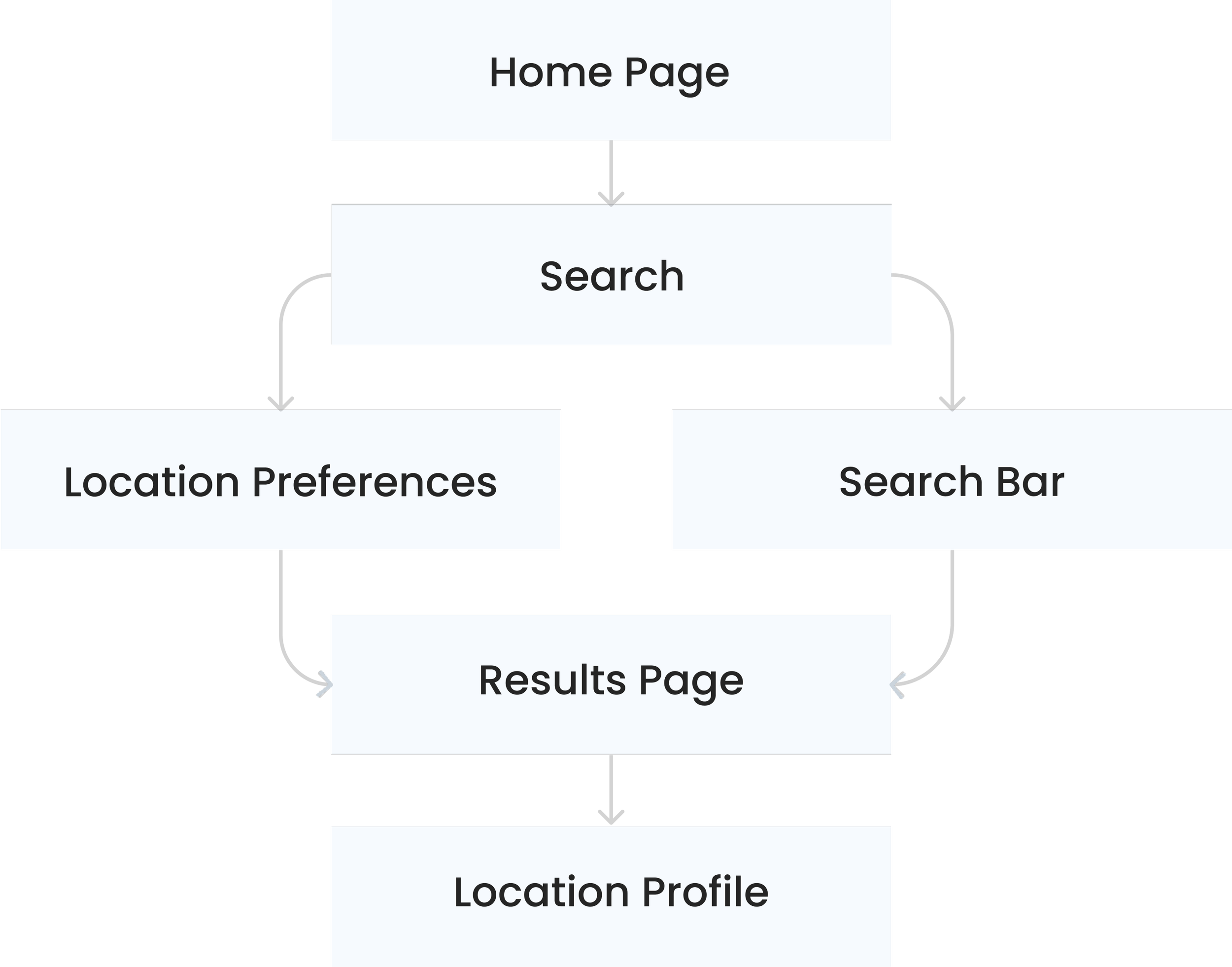
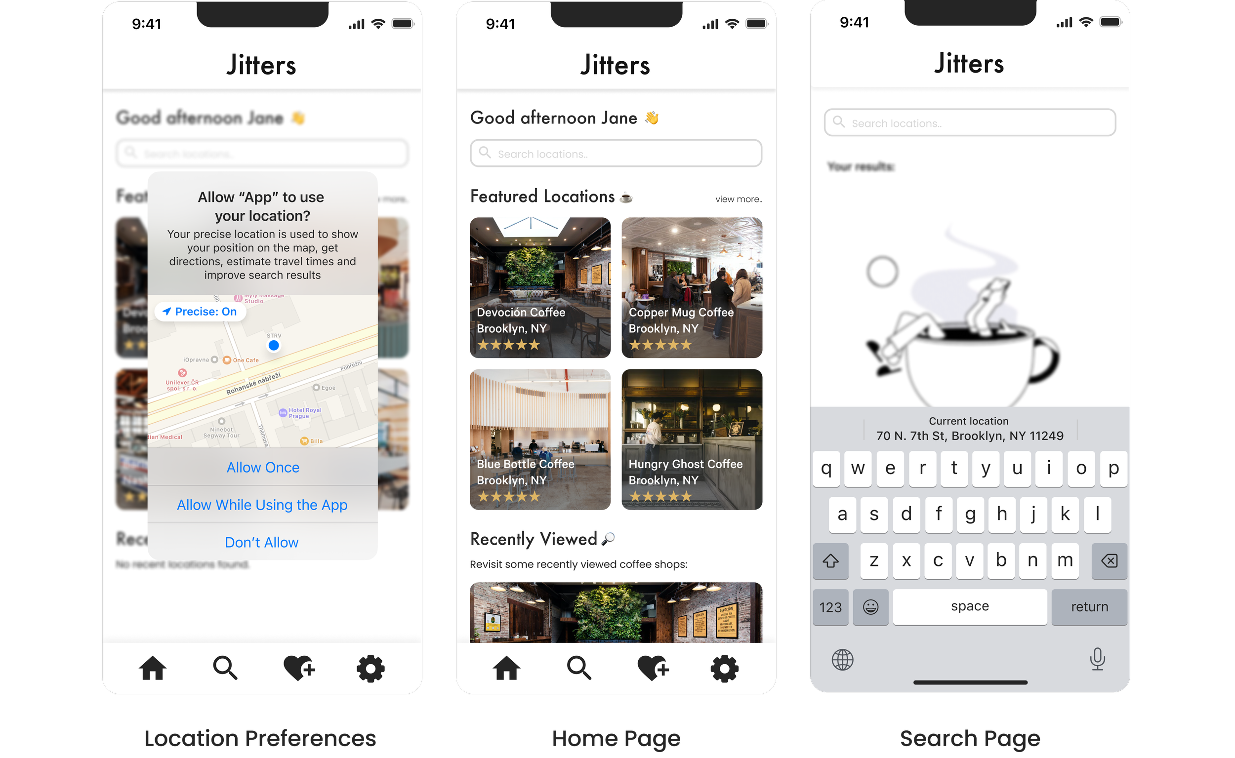
Functionalities

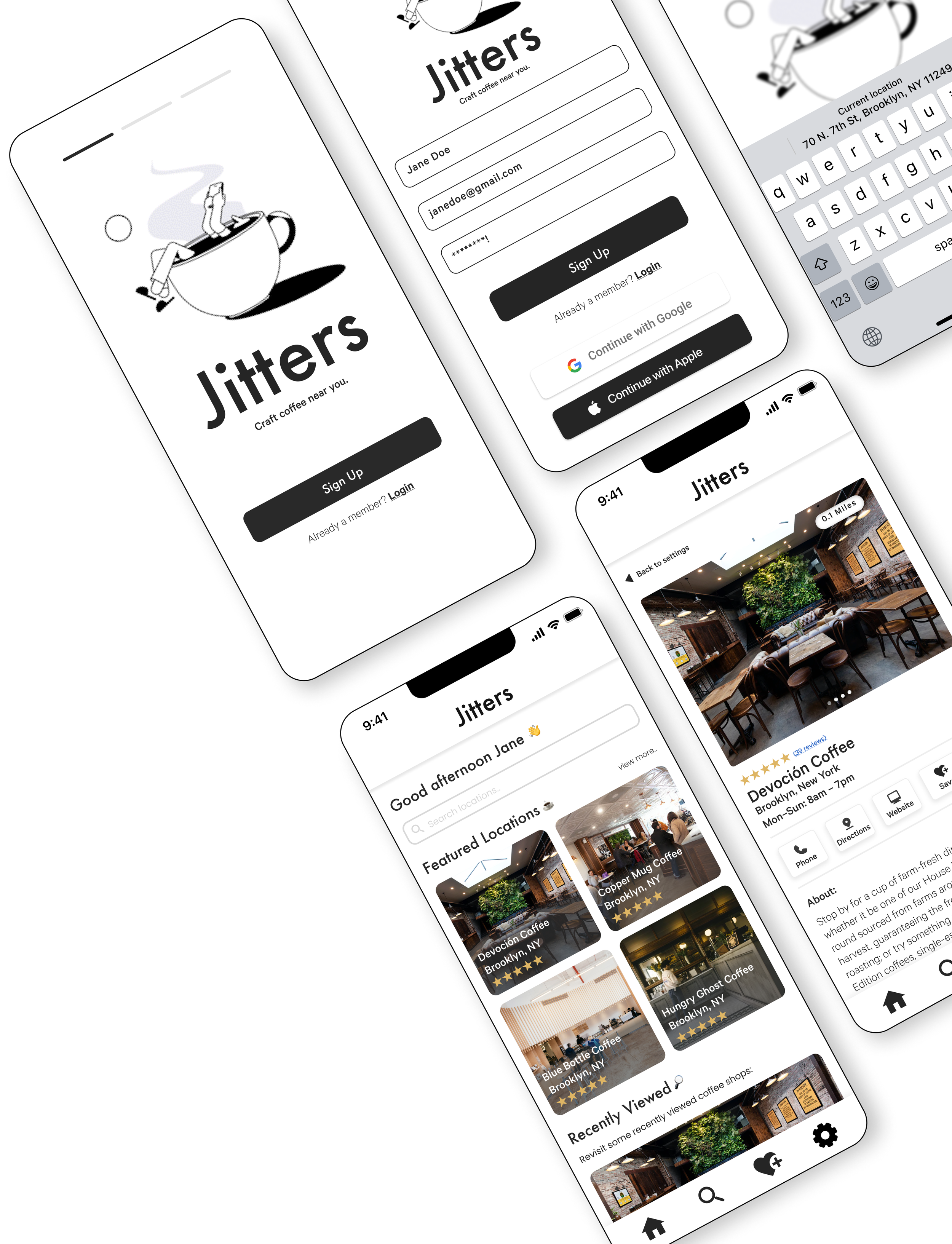
Major Screens:
Once the low fidelity wireframes were drawn out, and the sitemap and user flows were in place for the user journey, I began constructing my mid fidelity wireframes and clickable prototype in Figma to conduct several rounds of usability testing to validate the design direction. The main things I was looking for in the testing results were ease of use, ability to search for locations seamlessly, access to location reviews, and the ability to save individual locations.
Usability Testing
Conducting multiple rounds of user testing was important to the overall design of this application. In its delivery, I needed to make sure that it was delivering significant value to users, and addressing their main needs and issues with the current journey they were experiencing. After reviewing some of the data of the tests, there was a significant amount of positive feedback that was validating to the idea for the problem - however it was also clear there were some issues within the design that needed to be address. Some of the issues that participants brought to my attention were:
Positives:
Participants were able to easily navigate and complete the tasks quickly, without confusion of where they needed to go to find the correct information.
Users enjoyed the simplicity of the layout, and that it was informational to their needs of finding a new coffee shop.
The ability to save an individual location was easy for participants to complete, as well as revisiting the saved locations later on in the test.
Negatives:
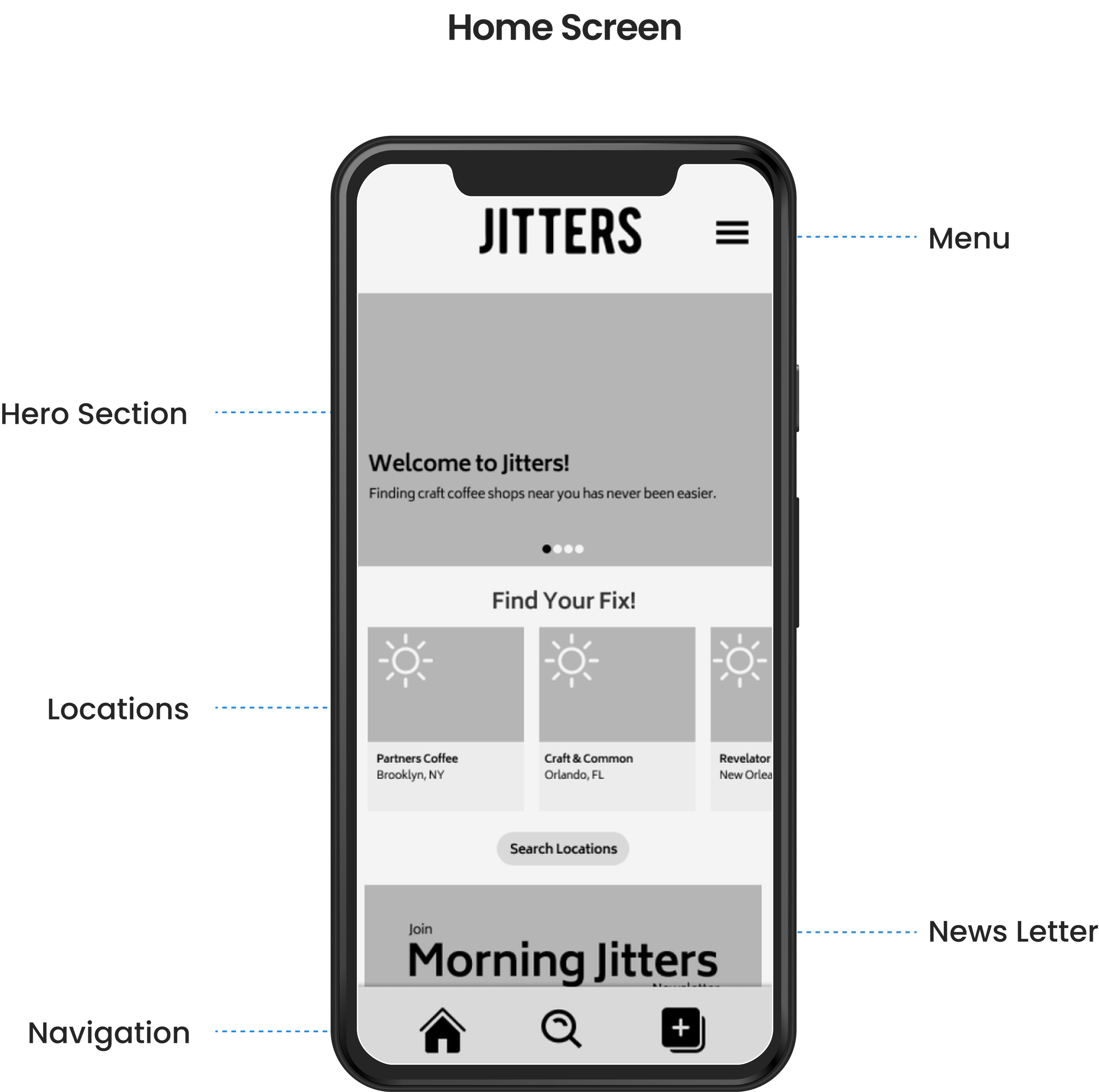
Participants were a little confused on the hamburger menu icon, as well as the entire functionality of the menu - as the key navigation areas are located at the bottom of the screen already.
Users mentioned that they felt the home page of the app could be simplified, and was a little cluttered - containing information that was not important to their mission of searching for new locations.
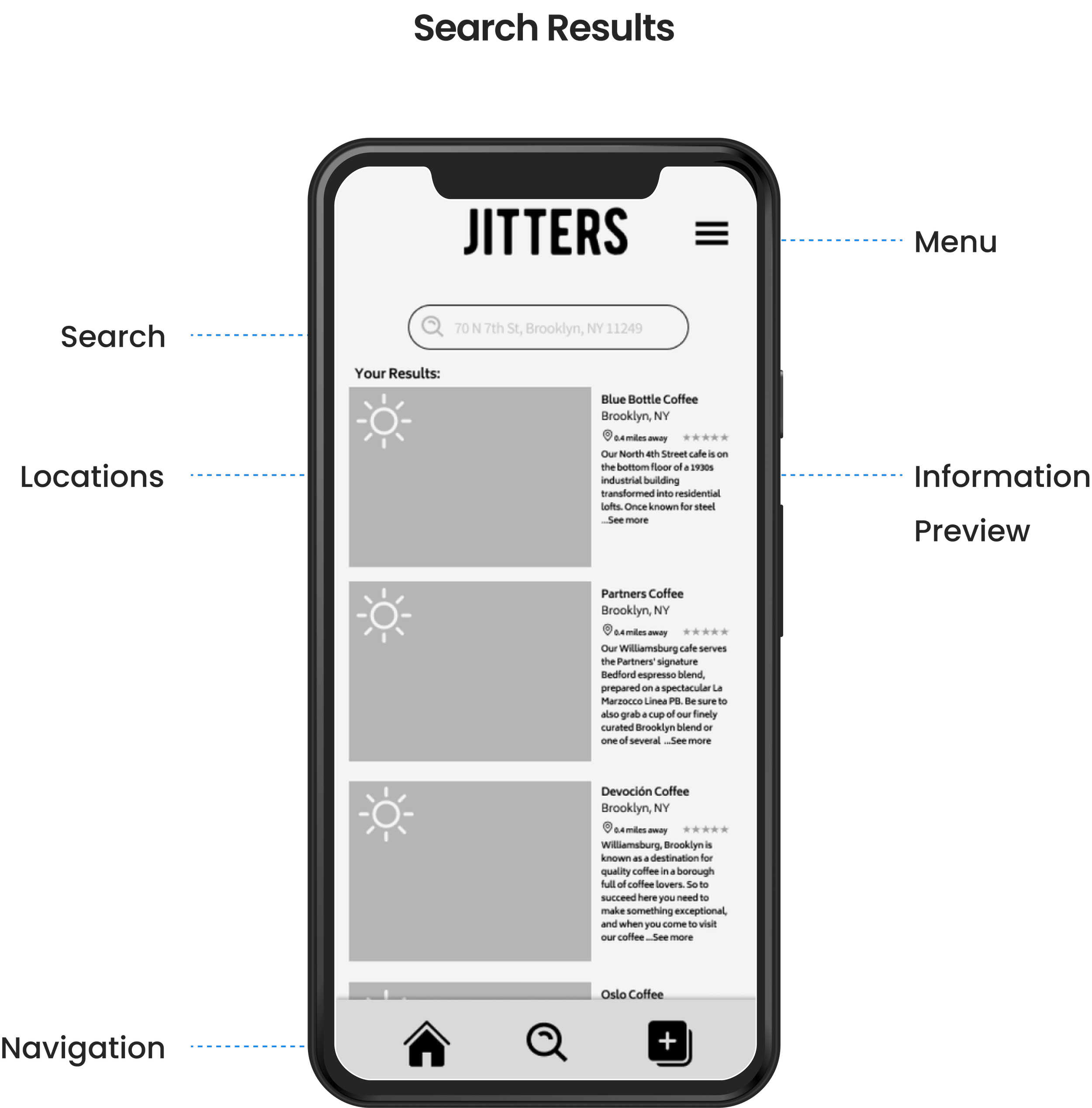
On the search results page, users mentioned that the information preview next to the locations image was a bit too condensed, and that at points was not easy to read.
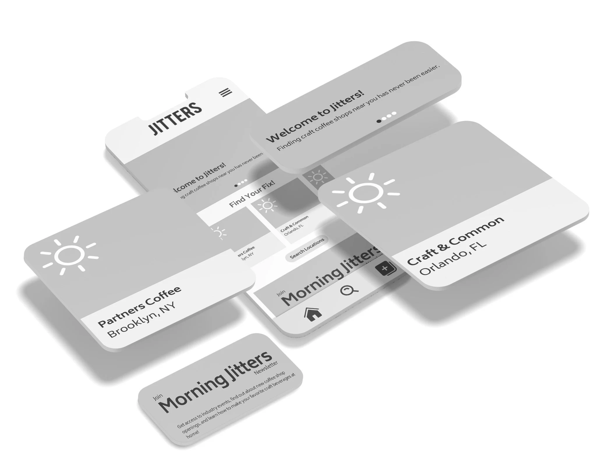
Iterations
After reviewing all of the results from the user tests, I realized that some of the design choices I ha previously made were not the best user experience. In result, I revisited the UX and the overall UI of the app, and brought it into a more streamlined direction of solving the main issues I was looking to address, without adding too many additional features that were not needed.

Version 1
Version 2
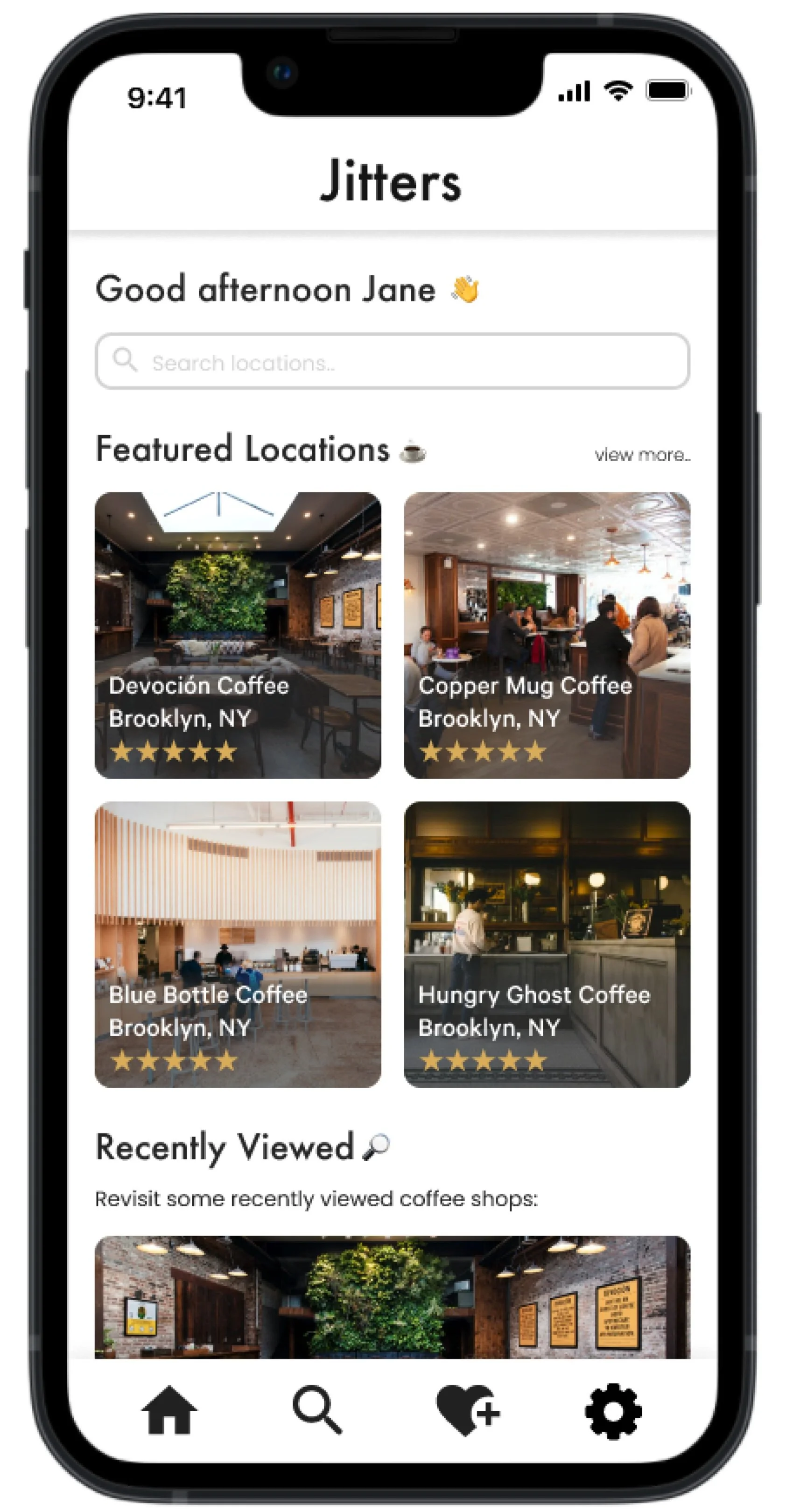
Final Design
After revisiting the UX of the app and the overall UI from the user testing, I iterated on the high fidelity wireframes and set final rounds of user testing to make sure the changes were validated by the data I had previously received. After the additional 3 rounds of testing, I was pleased to see that all of the previous issues had been resolved, and no further issues had come to light in the changes that were made.


Reflection
There were many challenges I faced while working on this project. One of the biggest challenges was taking myself and my opinion out of the equation when designing for the end user. Though my thoughts and opinions may be valid, and with previous industry knowledge of coffee, I am not designing this only for myself, but addressing the pain-points of my target user base.
Through my research, there were a lot of insights I gained into how users consume and search for information. Finding out what information is important, and what is not important to the user was key in determining how to structure specific pages. After understanding these findings, I was able to complete the design of the Jitters app that has tested to be user-centric, as well as intuitive to solve the issues of my core users.
